Friday, March 1, 2019

Vital Titles (2 of 4) - Focus on Fonts

Now that we have the basics under our collective belts, it's time to dig in to the fonts.  Where to get them? What's in a font file? What about the different font formats? So many questions! We won't be able to cover everything, but hopefully this month's session will give you some basic knowledge and tools to make your scrapbook titles a little more exciting.

One of the selling features, for me, of Silhouette Studio is the fact that it works with any font that's installed on your computer.  These are typically  TrueType fonts ("TTF") or OpenType Fonts ("OTF").

Note: if you have the software open and install a new font, you'll need to restart the software in order for the new font to show up. Remember to save the file you're working on first!

While these two file types are very similar, OTF fonts are sort of "smarter" and can do things like know to put a special merged "th" character in place of a t and an h, or automatically adjust spacing.  If you are in the mood for a cat metaphor for fonts and letters to explain this, check here. OTFs tend to have richer glyph abilities.  More on this later.

Where to get fonts


There are many places to get fonts, and they can range from free to VERY expensive.  I generally pick out free fonts, but I have paid up to $90 for a font before (being Desire Pro... I still love it.).

My top 5 go-to places for fonts are:
1. www.dafont.com (free - but sometimes they have limited functionality)
2. www.creativemarket.com
3. www.fontbundles.com  (#2 and #3 both have VERY nice font bundles. Not usually free, but very reasonably priced AND includes a commercial license in case you wanted to sell your wares)
4. Silhouette store. Not my number one choice, but you know they'll work in the Silhouette.
5. the google. Sometimes I'm looking for something specific and I'll just google it. You have to be careful though with downloading fonts from sites you don't know.  Safety first, peeps!

Choosing a Font


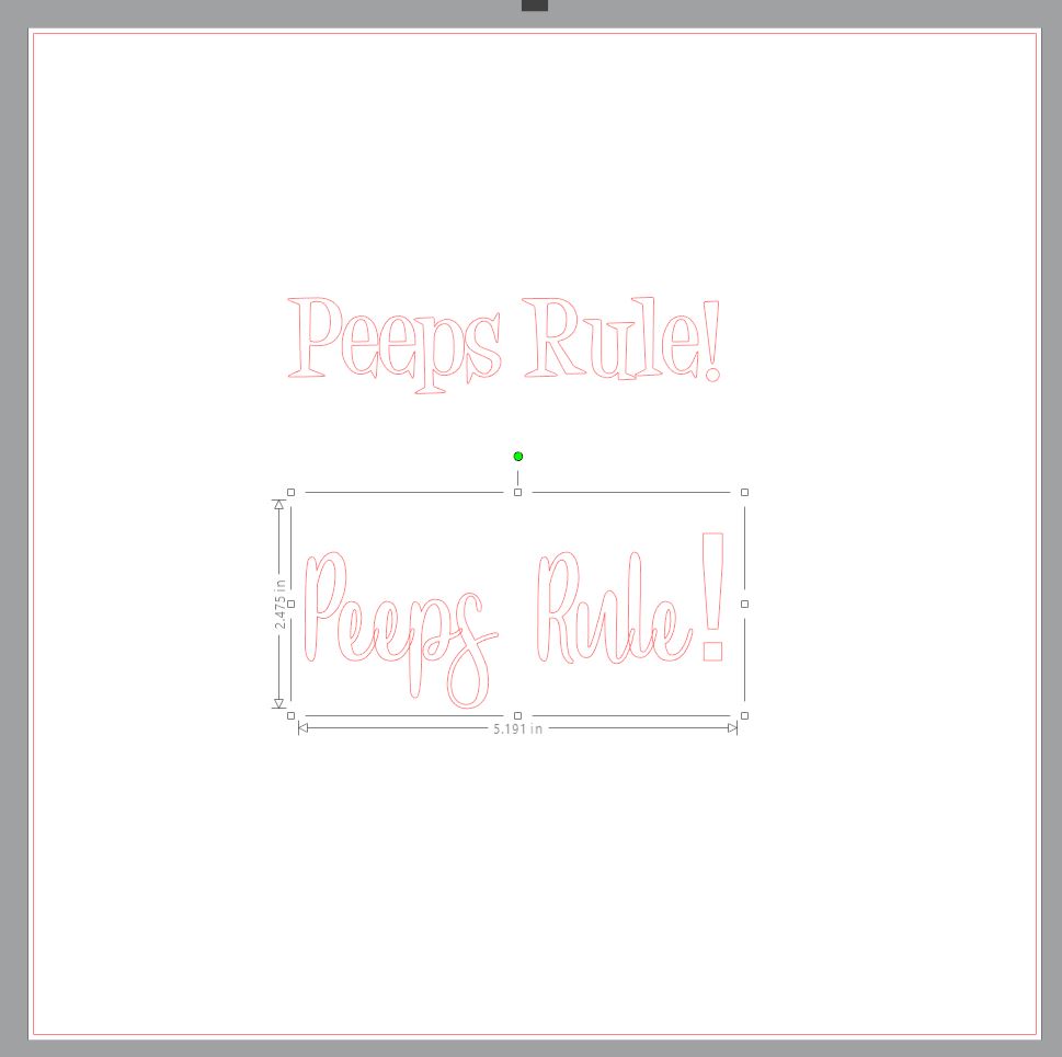
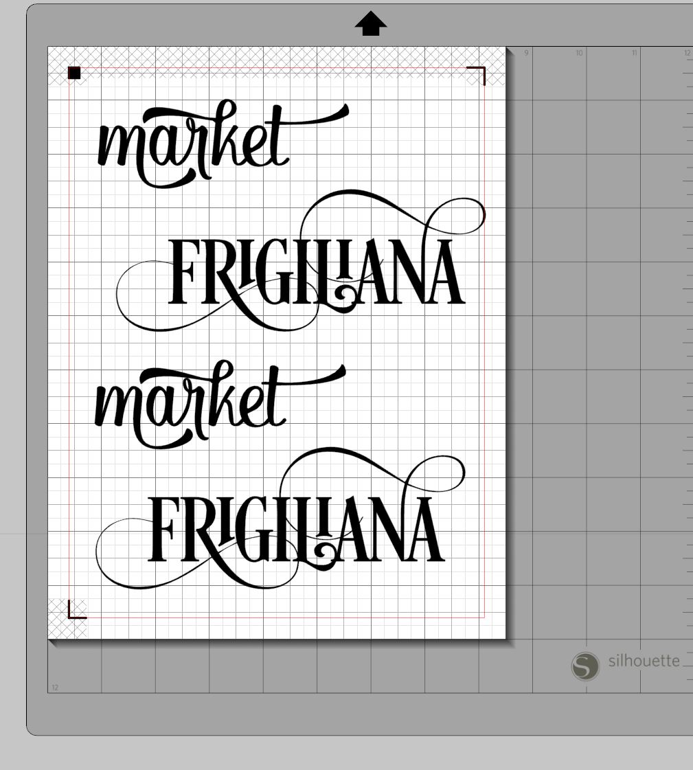
One of the most important things to keep in mind when choosing a font is that it needs to be THICK enough to cut nicely. There are so many pretty fonts out there, but anything really thin or lacey tends to be quite difficult to work with when cutting out of paper. Also, you should avoid "grungy" fonts. They don't translate well to cutting.

A couple of my free favourites that I've used repeatedly.

Sweet Hipster

Desigers - a little fun and quirky. Works well with kids and Disney layouts.

Mixing Fonts


It's quite a popular look now to mix different fonts. In one of those "I don't know why it looks better, but it just does" ways, mixing lower case and uppers, and mixing cursive and print looks good. Combining two different script fonts looks just odd. So, grab an upper case print, and a lower case cursive, and go to town.

Here are a couple of links with interesting examples. (Keep in mind, these fonts are not necessarily recommended for cutting, as several are too thin.)

http://www.joustmultimedia.com/blog/post/the-art-of-combining-fonts
http://popandgrey.com/tip-tuesday-i-the-art-of-combining-typefaces/

What to do with a thinner font?


Sometimes you can really love a font, but it's just too thin to work with.

There are three options if you MUST have a thinner font.

1. Cut it out of vinyl.  Vinyl is much more forgiving with fine lines. It cuts smoother, and doesn't tear the same way paper does. You can still use layers for the second and third layer to achieve a similar layered title look. Make it the same way you would have in last month's class. Just cut the first layer from vinyl and use transfer paper to stick it to the next layer.

2. Print and cut.  Have the fine first layer be printed directly on to layer two. And then cut the second and third layers. So, it's only two layers of paper. Does that make sense?

In this example, it's only one piece of paper, but I made the title (using Desire Pro, *obviously*) directly as a print and cut. You must be sure to remove the cut lines from the title first, and leave them only on the offset. In this case, I printed onto a laser printer and then ran it through a laminator with foil, so it's actually quite shiny.

http://i156.photobucket.com/albums/t31/ronadt/Spain/DSC_0840_zpsfprsovmp.jpg

Here's a quick demo on how to create a print and cut file:


Once you've made the cut file, here are the instructions on how to actually do the print and cut:
https://www.youtube.com/watch?v=MvjQcUncJPs

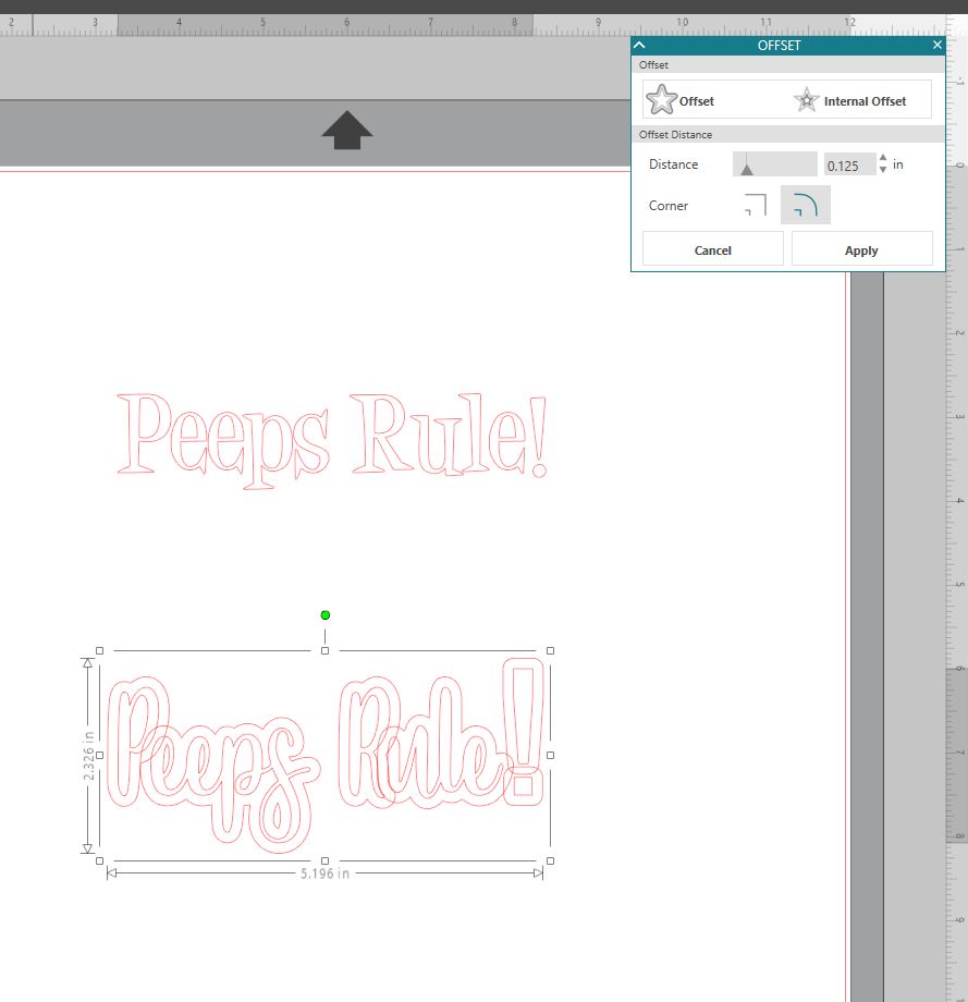
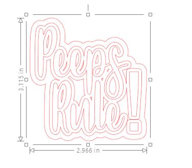
3. The last option is to use the offset feature to thicken up the font a bit until it's workable.  Just do a very small offset. Here's a quick how-to.


Glyphs and Ligatures


Glyph - each character in a font is a glyph. We tend to generalize that glyphs are like extra versions of characters, so an alternate "a" for example than the one that's just typed by hitting the "a" key. Sometimes glyphs aren't even letters, but could be just a fancy swirl.

Ligature - a single character that represents multiple characters joined together in a pleasing way. Like a "th" where the crossing of the "t" becomes part of the "h" character.

There are also Swashes, little swirls and lines that are just cool. :)

If you have the basic version of Studio, you won't have the Glyph feature built in. One way to get around it is to use the Character Map feature built into Windows.  Another way is to make your title in another software, such as Adobe Illustrator (not free) or Inkscape (free), and import it over to Studio (hoping for help here)

Using the Character Map


Let's go back and look at a simple font like Sweet Hipster for a moment, using this link: https://www.dafont.com/sweet-hipster.font  This actually brings up a character map of the font. You can see that there are normal capital letters and lower case letters, numbers, and symbols in the places where you'd expect to see them. But IN ADDITION, you can see a couple of swirls where the brackets would normally be.  This tells you what character to type to bring up that different character.

On your (windows) computer, follow these instructions to use the character map:
https://www.digitalcitizen.life/use-special-characters-windows-7-character-map

And I'm taking a wild guess that this is the equivalent thing on a Mac (please let me know if this isn't correct and I'll update it):
https://sites.psu.edu/symbolcodes/mac/charview/

So, knowing what the characters are, if you type "(peeps rock)" into Silhouette Studio,


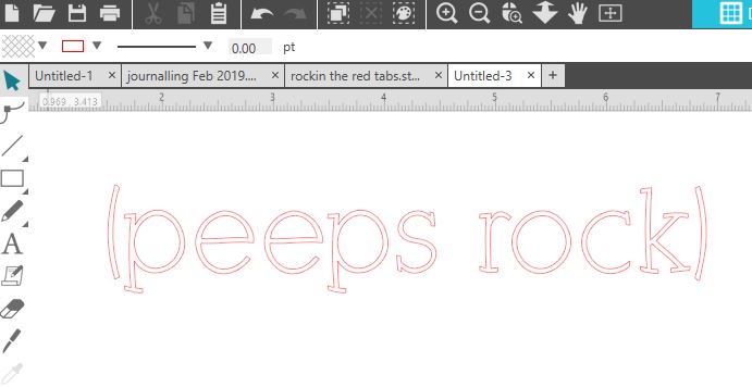
and then change the font to Sweet Hipster, you get this magic:


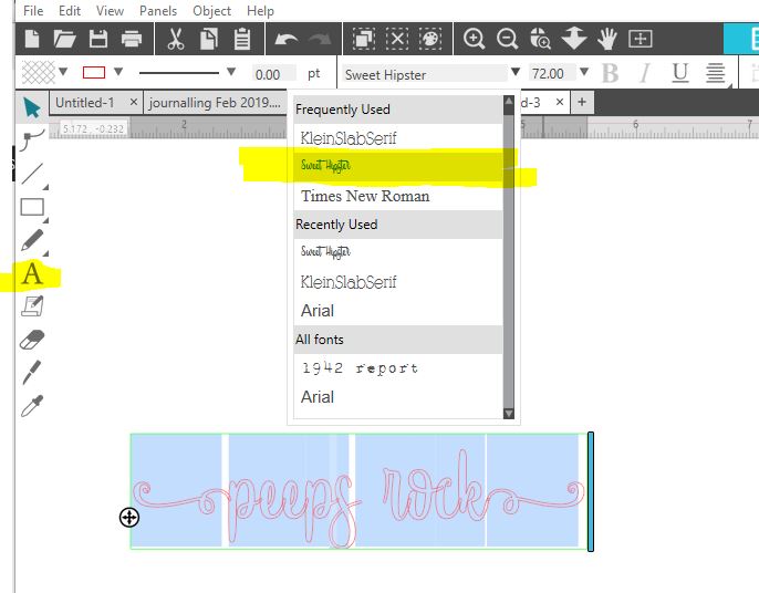
Now just merge and carry on making your title.

Note that you can cut and paste from the character map as well, if there isn't an easy key to type. You just need to find the letter in the map first.

By the way, there are some fonts that are built for being used this way, and not for the glyph functionality that I'm about to talk about. These are called "PUA encoded fonts," and you can access ALL of the special characters through the character maps.  Good instructions in this link:

https://www.creativefabrica.com/the-ultimate-font-guide/pua-encoded-fonts/

Here's an example of a font bundle that includes PUA fonts for all of them (this link may die at some point):
https://fontbundles.net/the-brilliant-font-bundle-iv

Did you see that "bombing gang" font? I think I'm going to have to try that one!

Using Glyphs Directly in SSDE


I'm so happy that they finally added glyph functionality into SSDE. Unfortunately, it's not available in the free version, so you'll have to use the methods above if you haven't upgraded, and they're not bad options.

I don't need to reinvent the wheel on using glyphs in SSDE as there are several videos out there already.  Please check this video out by Lori Whitlock:

https://www.youtube.com/watch?v=QEfNjfJP22U


There are so many things I wanted to include this month, but I don't want it to be an overload. Let's leave it there for now. 

So, this month, I want to see you trying to use some glyphs and alternate characters in your title work!

Friday, January 25, 2019

Vital Titles (1 of 4) - The Basics

This is the first of a four part series (one per month) that will, hopefully, give you some ideas and pointers to improve your title work on your scrapbook pages. As I primarily use a Silhouette Cameo, instructions for digital cutters will be mainly geared to Silhouette Studio (v 4.1.479DE), but if I can find a link to a similar tutorial for a Cricut, I'll do that.  Many of the ideas are generic, though, and with some creativity, you should be able to apply the principles to your craft regardless of the cutter that you use.

This month, we'll start with the basics: premade titles, making a simple title, basic welding, sizing, and layers.

The easiest titles to do are premade titles. Super super easy... go to a scrapbooking expo, visit a booth, and buy a title.  On a difficulty scale of 1 to 10, this is a 1.  Next up would be buying some Thickers and sticking them down. That's maybe 3, if only for the added trouble of trying to make a straight line. But you know these already.  We're here to take it up a notch.

I know many of you have got a lovely Cameo. In a box. In your cupboard. Time to crack that baby open!  Open up your software. Maybe update it (Help/Check for Updates...). And here we go! This first task is really for beginners.

TASK 1: Using a predesigned title from the Silhouette Store


There are a couple of ways to find cool titles in the Design Store. If you have time on your hands, and just want to browse, go to Designs/Phrases and Monograms/Phrases. You'll get 200 pages of potential titles. There are lots of other things in here, too, such as files intended for t-shirts and wall designs. Add "title" to the search bar to narrow things down a bit. Have a look around. If you click on a design you like, you can see who the artist is. Click on the artist to see more titles you'll also probably love.  Or just use the search bar with whatever you're interested in and "title".   Such as "birthday title."

For today's example, I'm choosing a nice title for a birthday page simply called "happy birthday." You can pick the same one, if you want, or any other title that strikes your fancy.  For some reason, the majority of the premade files I like end up being Miss Kate Cuttables. Be sure to check out her site directly for daily freebies.

SECRET TIP: use a screenshot tool ("snipping tool" -- soon to be called "Snip & Sketch" -- is built into Windows) to grab the preview of the title from the design store so you can see how the layers are to be built.


Once the title has been purchased, it shows up in your library. You have a title preview here, too, but it's a little smaller. Double click the title, and it'll open up in your software. You will see all the individual pieces (grouped together), all outlined in red.


If you have a complicated title, this is where that little screenshot will come in handy. You can paste it onto the sheet and save it for prosperity (File/Save As/Save to Library). You CAN access the picture through the store again if you want, but I find this saves a step.

The next thing I do is to rebuild the title on the screen so that I can see how it would look. I use the "fill tool" to colour in the pieces and try to match the original image as closely as possible. You will need to select the title and "ungroup" it first (right click, "ungroup"), unless you want all the pieces to be the same colour. 


Then layer them together to mimic the original. Now you have a good idea of what the pieces would look like if you cut them the way they are. Be sure to GROUP them back together, so that when you resize a piece, they all resize proportionately.

You probably have your screen set up as a 12x12 page. Now you can see the size of the title in proportion to your layout. You can see that, as is, this is way too small for a page. You're going to need to make it bigger... but how big to make it? SECRET TIP: Make some rectangles to lay out on the page where photos or journaling would be.  For this layout, I'm going to use a PageMaps sketch from Jan 2019. So, my next step is to lay out the basics of that sketch on my screen.


Now I can resize my title to the size that looks visually appealing. Be sure to hold down the "SHIFT" key when you do this to keep the vertical and horizontal dimensions of the title steady.


Now you have your title in the right size. You can delete the paper and photo placeholders, and ungroup your title. Move the title pieces around so that like colours are together for cutting.  In a case like this, I might duplicate the stars and make extras for embellishments on other parts of the page. Feel free to take artistic license and cut in whichever colours are best for your layout. The rest of the process is basic cut and stick.

This video shows the play by play of the above instructions. The only problem was that my video capture didn't pick up anything that happened in pop up windows, so you'll have to use your imagination for those parts (although the instructions are written out above).


TASK 2: Making a simple title from scratch

So far, so good, right? But what happens if you can't find what you're looking for in the store? You wanted to find something like "Arabella Says He-dow" or some other random title. Or maybe you are thinking, heck, I'm not spending my hard earned money on a title that I can easily make myself.  Today is your lucky day. Today you learn how to do this (or, you read this refresher and maybe learn something new).

The first thing you need to do it write some text. Choose the "Text" tool that looks like a capital "A", then type your text.


Want to change the font? Go for it (highlight the text first, then change it at the top - I'm choosing Desigers because it's fun, and free).  This font is not cursive, so I don't need to weld anything. 


If I picked a cursive font, I'd need to weld. Sweet Hipster is a fun one. I'll change the font to that... but now it's really small. I can change it using the font point size, next to the font name, or I can select the whole text (click the select arrow first) and drag the corner to resize. Hold down the SHIFT key while you do this so you keep the proportions correct.


As you can see, this needs to be welded. It's a single click once the title has been selected. Click on the "weld" icon, or just right-click, weld. Now that it's welded, there's a good chance you need to Group it again, so drag the cursor so that all of the title is highlighted, and right-click Group. Now you have a perfectly good title which you can resize as desired, and use on your page.

What's that? Oh, you want LAYERS? Ok cool. We can do that. That's done with the Offset tool. The icon looks like a star with a border around it. Or right-click Offset.

(By the way, SECRET TIP if you just have a manual cutter, like a Big Shot, you can achieve a similar look to shadow by cutting the letters 2 or 3 times and gluing them together with a bit of an offset. This is especially effective if the bottom layer is black. I LOVE that effect!)


Now, when I do this, I don't love the look. Personally, I like my titles to look more cohesive. So, I'm going to UNDO the offset (ctrl-z) and then move the words closer together. Vertically, actually. I've got to ungroup it first, and then group one word, move it, then group it all again.

Now I'm ready to do the layers in my own style. For some reason, I really like the look of a triple-layered title. Here's my SECRET TIP to layers... do the first layer at 0.08, and the second at 0.125.  There you go. I don't know why, but these layers always look good.
You might need to do a little fine tuning so that you don't end up with little tiny bits cut out. Drag the layers apart. Right click on one where you need to clean it up, and Release Compound Path. Then you'll be able to delete the little bits that aren't worth cutting. Once it's cleaned up, Make Compound Path again. You'll be able to fill the words in using the fill tool, and rebuild the title so see how you like it. We'll do more of this next time. Now, go forth and cut! I can't wait to see what you make.
Here's the step by step on video (it's in 2 parts because I'm technically challenged and can't figure out how to save the right format if I merge them):


Next month: Tips on choosing and mixing fonts, using glyphs, and more on welding

Sunday, January 15, 2017

Dog In Waiting

What?! Two layouts posted in one month? What's going on here?

This layout was based on Laura Whitaker's sketch from Stuck?! Sketches:


I love using sketches as my jumping off point because it reduces my process time significantly. ONLY three hours this time. ;)


This was so much fun to make because (a) I loved the photo, (b) I loved the doggie papers and embellishments I've been collecting, and (c) I loved the sketch.

Thanks for looking!

Materials: pawprint stencil - homemade, dog papers - Bella Boulevard and Doodlebug. Wood veneers - Jillibearn. Journalling block - Evalicious

Saturday, January 7, 2017

The Need for Speed


(Cue the "A Team" theme song...) I love it when a plan comes together.

I recently (well, *last year*, but I moved house so haven't had a chance to play) acquired some of the newer Evalicious line "On My Way."  When I get new goodies, I leave them on my desk for a bit until something clicks about how to use them.  Organizing my stash, I came across the Pink Paislee "Cedar Lane" line and, wouldn't you know it, they have very similar colour schemes. We haven't had any big travels or road trips lately, but the pup *does* love a car ride to the dog park.  A plan was borne.


The new epoxy stickers are gorgeous... see the heart above? They're so nice and shiny.


Mixing in a few of the original woodgrain puffy letters.


While moving house, I acquired an old Remington Portable 5 typewriter. It's SO much fun to type on these journaling cards with it. :) I really need to work on the accuracy of my typing, though. No delete key!

And I'll leave you with this pic of Remy the bernedoodle, in heaven with her hair blowing in the breeze... it sure is a dog's life!


Supplies: Evalicious On My Way embellishments, Pink Paislee Cedar Lane 6x6 paper pad

Sunday, June 19, 2016

Machine stitching on a layout - with embroidery floss!

I LOVE the look of hand stitching on layouts, but it takes me FOREVER.  So, I started googling "machine sewing with thick thread."

So, the problem with trying to machine sew with embroidery floss (well, ONE of the problems) is that you can't thread the thick thread through the needle. Let me introduce you to "bobbin work."  In a nutshell, the top thread is normal sewing thread, and the thick thread or floss goes on the bobbin and you work the page upside down. 


Technical information about how to do this can be found here:
http://www.threadsmagazine.com/item/5025/bobbin-work-when-threads-are-too-thick-for-the-needle/page/all

I decided to give it a shot, take one for the team, and do a sewing experiment. Very little risk for me as I hardly ever use my 20 year old machine for anything except scrapbooking these days.


I loaded the bobbin as per instructions in the link above. I held the feeding floss in my hands and used my fingers for tension. Once loaded, I popped it into the bobbin case.


And it's definitely true that you need to test the tension. The first one I tried (at "0" and "1") just looked like a piece of string stuck to the page with thread around it. It had to be set quite tight (like "8") before it looked decent. Excuse my scrawl, but the numbers do refer to the tension setting. Your results may vary. I also set the stitches as long as possible to better mimic hand stitching.


The photo above shows the underside of the paper after sewing.  I found that I quite liked the look of it with the high tension. For perspective, I would normally sew on fabric with a "3" or so, but the tension needs to be high so that it pulls the floss into the paper.

Once I knew it worked, I set down to business... making a layout. I used a Scrapbook Generations sketch that had lots of stitching on it. I stitched first, because it has to be done on the back side of the paper. Some planning needs to be done here if you want to try anything fancy.  After I sewed, I pulled the ends through to the back of the layout and taped them down.  And here's the finished look:


The stitching on this layout took about 5 minutes. Yes, you read that correctly!  A couple of closeups:


Next time, I might make the tension a little higher, even, but overall, I think I've got a winner!

Materials: buttons, puffy stickers, wood veneer - Evalicious, patterned paper - basic grey, sketch - Scrapbook Generations

Tuesday, April 26, 2016

Magnet fishing

This is a story of how a layout evolved.

I had some photos of my son magnet fishing, but needed good embellishments. Do you know what shape the Silhouette Studio store is missing (as of today, anyways)? Magnets! Luckily the tracing feature came to my aid.


After I had traced out the original shape, I split it into 4 different colours so that it would end up looking nicely 3D.


I also had some great older Little Yellow Bicycle paper that I had been saving up for a good boy page.

But then I needed a plain background behind the photos so they didn't get overwhelmed. I happened to be at a crop with lots of shopping. As luck would have it, the new Carta Bella release had some great light grey gear paper. The perfect shade to match the LYB, plus great texture.

And things just fell into place after that. Some Crimson Thickers, some gears that were crop freebies layered with Spellbinders gear die cuts (dies borrowed from a fellow cropper)... et voila.


Materials: Little Yellow Bicycle - Fern and Forest Boy Collection, Carta Bella - Work Hard Play Hard Working Gears, Thickers - Crimson

Monday, April 18, 2016

Whoosh.... that was time flying!

Aaaaaand, I'm back. :)

I wanted to share a technique I started using last year. I had super great intentions of blogging what I had created with some foil and my laminator, but, well, that didn't happen... until now!

Lots of people have seen or tried the Heidi Swapp Minc tool that allows  you to create stunning foiled embellishments. Or maybe you've done the same thing as me and just bought a cheap laminator and laser printer? Either way, prepare to have your mind blown with print and cut foil like this!


Start off by making a title. You can make it directly in Silhouette Studio (fill with black), or, in my case, I did it in Adobe Illustrator in order to take advantage of the cool glyphs in the fonts. By the way, I used Desire for "Frigiliana", and Karmela for "market."


Once you are happy with your words, click to show the registration marks, and make sure that none of your titles are covered by those marks or in the non-printing/cutting area.


Now, add the offset. This is necessary for these titles because the font lines are so delicate. Change the line colour for the offset. I made mine orange. You'll see why in a moment.


Now, here comes the trick to the success of this process. You want to cut the outline of the offset, but NOT the words. To do this, you need to go into the ADVANCED cut settings. For my titles, the cut line of the words was black and the cut line of the offset was orange. So I unselected the black line so that it wouldn't cut.


Now, you're ready for action!  Go ahead and print to your laser printer. If you can darken the black or make sure you're not going light on the toner in your settings, do it. It'll make the foiling better.

And once it's printed, go ahead and cut it on the Silhouette.  Once the pieces are cut, go ahead and foil it!

And here are those titles in action, both using the Heidi Swapp Mint Green foil.


I will have to toot my own horn a bit and say that those titles look better in person than photographed. The pictures don't do the pretty shininess justice.

Thanks for looking!

Materials:
Frigiliana uses mainly Fancy Pants Office Suite, Evalicious paper clip, some Heidi Swapp paper
The Market in Malaga uses mainly Pink Paislee Atlas
Credit to Scrapbook Generations for their sketches